Articles
-

Feb 20 2024
Japan’s Top Social Media Platforms for 2024 - 9th Edition
Last Updated: February 22, 2024 Yet again, Japan’s top social media network is LINE with over 95 million users and over 85% of the population using the app every day. A long-standing preference for X (formerly Twitter) over Facebook, as well as the modest size of LinkedIn’s user base, are two more striking examples of how the Japanese SNS landscape is set apart from the rest of the world. In our 9th report, we not only explore such quirks but also shed light on the “why”—outlining the most important data and digital insights available right now, all grounded in real world experience from our Tokyo office. For an explanation of how we draw our conclusions at Humble Bunny, head to the bottom of the page for our methodology and sources, otherwise, let’s dive in! Table of Contents Japan’s Digital Landscape in 2024 Monthly Active Users by Platform Key Behavioural Trends in 2024 LINE Japan YouTube Japan X (Twitter) Japan Instagram Japan
Read More... -

Aug 27 2023
AI Writing Tools in Japanese - Do They Work?
One significant development in the emergence of AI technologies is how they’ve revolutionized the way we generate, publish, and disseminate written content. With the emergence of Chat GPT, many brands and marketers now integrate AI into their workflow, whether it’s for research and ideation, or to create first-draft content. But how well do AI writing tools work in languages as complex as Japanese? We explore! Table of Contents How do AI writing tools work? Top AI writing tools with Japanese language options Should I use AI writing tools to create content in Japanese? How to harness AI writing tools in 2023 How to select an AI writing tool in Japanese Building an SEO Strategy for Japan? Let Us Help! How Do AI Writing Tools Work? Most AI writing tools operate on advanced natural language processing algorithms. These algorithms analyze massive amounts of text data to learn grammar, vocabulary, writing st
Read More... -

Aug 27 2023
The Japanese Super App Race: Who Is Winning?
With the emergence of super apps and their ability to integrate multiple services, from ecommerce and payments to social media and transportation, consumers, brands and marketers worldwide are faced with the compelling challenge of navigating this revolutionary concept. This article explores the key considerations that have influenced the success of super apps in Japan like LINE and Rakuten—currently trying to bridge the gap between innovation and traditional app paradigms. Table of Contents What is a super app? Western vs Asian super apps What about Japanese super apps? Leading contenders in the Japanese super app race—LINE vs Rakuten More contenders in Japan's super app race Factors influencing the Japanese super app race How are super apps changing Japan's advertising landscape? The future of super apps in Japan Entering the Japanese Market? We Can Help! What Is A Super App? A super app is
Read More... -

Aug 26 2023
Marketing Automation in Japan — An Industry Overview
Japan’s marketing automation landscape is still being shaped by advancements in technology and changing consumer behaviors. At its core, it offers businesses and the marketers that serve them the opportunity to automate repetitive or formulaic marketing tasks, allowing them to make improvements to their processes, such as increased productivity, personalization and audience targeting accuracy. Operating across various channels, from emails to social media and beyond, we outline the major providers of marketing automation tools in Japan and how companies are leveraging their services. Table of Contents Marketing automation usage in Japan (in billion JPY) Marketing automation vs CRM software How are businesses leveraging marketing automation services in Japan Automated social media management in Japan What to consider when using marketing automation in Japan What's next for marketing automation in Japan Building a Japanese PPC Campaign?
Read More... -

Aug 15 2023
Using AI in Japanese Marketing - 5 Potential Use Cases
Operating across various channels from emails to social media and beyond, we outline what AI marketing means, the major providers of marketing automation tools in Japan and how companies are leveraging their services. Table of Contents What does AI marketing mean? Content creation Chatbots and virtual assistants for better customer service Marketing automation Customer personalisation and customization Building a Japanese PPC Campaign? Let Us Help! What Does AI Marketing Mean? AI marketing is the process of using AI tools and systems such as data models, algorithms and machine learning to support a wide range of marketing processes. This includes producing insights that businesses can be used to improve marketing activities as well as the actual execution of a range of functions with little or no human oversight. Many businesses can benefit from free-to-use and off-the-shelf AI services, while larger en
Read More... -

Aug 15 2023
Reels and Shorts in Japan - The Role of Short-Form Content in Japanese Social Media
Short-form video has become a fundamental aspect of social media in Japan, with TikTok, Reels, and Shorts gaining immense popularity. These formats seamlessly cater to the constantly changing preferences and behaviours of users today, as well as increasingly short attention spans in Japanese society. We explore how the engaging nature, shareability, and entertainment value of short video content is so uniquely effective in Japan today. Table of Contents Short-form video in Japanese Society The power of short-form content Tiktok, Reels and Shorts: how are they different? Is long form content still important in Japan? Should you add reels and shorts to your Japan social media strategy? Have Questions About Marketing in Japan? Contact Us! The Role of Short-Form Video Content in Japanese Society Long before the emergence of TikTok, Reels and Shorts in Japan, the short-form video format was already a staple
Read More... -

Aug 15 2023
Marketing On Threads in Japan – Is It Worth the Gamble?
With over 150 million users after just 7 days of its launch, Meta's latest Threads platform became the most rapidly expanding online platform ever. And while Japan stands among its top markets for sign-ups, businesses and marketers remain unsure if it’s worth it. In this article, we delve into the platform's initial reception and potential obstacles to widespread adoption within the context of Japan's distinct cultural nuances and unique social media landscape. Got Questions About the Japanese Market? Let Us Know! Japan’s Reaction to Threads So Far Initial figures show that India, Brazil and the US are Threads’ top markets for downloads, but Japan isn’t far behind with over 7 million app downloads by July 12th 2023. *Tap or Hover on the graph below to see details. Source: Data.ai Japan is Threads’ 5th biggest market globally with over 7 million downloads. That said, an initial review of t
Read More... -

Jul 25 2023
Japanese Meta Trends and the Role of Facebook in Japan’s Diverse SNS Landscape
Few platforms have achieved the same level of global dominance and ubiquity as Facebook (now Meta). However, the Japanese market presents a fascinating contrast with LINE, Twitter, Instagram and YouTube all ranking higher than Facebook in terms of popularity. We explore the cultural influences that have shaped Meta’s usage and perception in the Japanese social media landscape. Building A Japanese Social Media Strategy? We Can Help! Forecasted Number of Facebook/Meta Users in Japan *Tap or Hover on the graph below to see details. Source: Statista In many other respects, Facebook’s success in Japan has been modest. It has a dwindling youth demographic and as well as having a smaller user base than Twitter and LINE, long-term growth of its users is expected to be outpaced by the increasingly popular TikTok. For instance, some projections for TikTok’s user growth in Japan predict the platform will have over 22
Read More... -

Jul 25 2023
Google Search In Japan — Key Search Trends and Insights
Individuals and businesses in Japan rely on Google everyday for online searches, whether it’s for information gathering, product or service discovery, entertainment or other reasons. We take a brief look at some of the major Google search trends from Japan and consider how they are impacted by cultural, linguistic, and regional influences. Building a Japanese PPC Campaign? Let Us Help! Factors Influencing Google Search Trends in Japan Google search trends can vary significantly between countries due to cultural, linguistic, and regional differences. Below are some important factors that can contribute to the variation in Google search in Japan and other markets. With native Japanese speakers making up around 99% of the population, searches will be made primarily in the Japanese language. 1. Language The primary language spoken in a country can impact search trends. People are always more likely to sear
Read More... -
Jul 25 2023
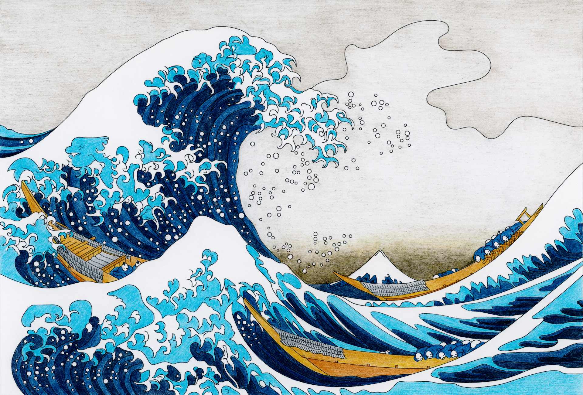
What Influence Has Japanese Graphic Design Had On the World?
Japanese graphic design has left a lasting impact on global design trends, influencing brand concepts, typography, packaging, user experience and more. Among other things, the Japanese principle of minimalism and the art of blending tradition with innovation continue to inspire designers around the world. Building A Japanese Ad Campaign? We Can Help! Japanese Graphic Design Trends Used Globally Unique Typography Japanese graphic design frequently features bold and expressive typography. The use of unique fonts, calligraphy, custom lettering, vertical orientations and creative typographic layouts has influenced global typography trends. Many designers emphasize the visual impact of text and pushing the boundaries of what it can achieve—inspiring designers worldwide to experiment with typography in innovative ways. Minimalism and Simplicity Many designers working in Japan place a strong emphasis on simplicity, minim
Read More...