Why does this matter to you?
Being a designer in Japan and doing a variety of work in the Japanese language, I’m constantly on the lookout for usable Japanese typefaces for my work.
If you’re like me and are trying to find reliable, flexible typefaces for your writing/creative ventures, this list of fonts will be of great value to you. It can be quite a burden to find typefaces that are exactly what you need. I’ve done all the work so why not take advantage of it?
If you haven’t read it yet, check out last week’s article for a look at understanding Japanese typographic lingo.
Why are Japanese typefaces so hard to find?
The quick answer: Too many darn characters!!
Japanese is comprised of three alphabets used in and amongst each other: hiragana, katakana and kanji. Between those first two, you’ve already accumulated well over a hundred characters when you take into account all the versions of each. Kanji alone: thousands of characters. It’s said that the average newspaper-literate individual will have a solid grasp of just about two-thousand kanji and full fluency of the first two alphabets.
I’d like to see you create a typeface for all those characters!
Criteria For Finding A Good Japanese Font
The following fonts/typefaces were selected under these simple criteria:
- The font must be usable when using the Japanese input method. Many fonts just assign a random Japanese character to an English letter, thus resulting in gibberish. When you’ve switched your input method to Japanese and begin typing, these fonts perform correctly.
- The font must have all three alphabets: hiragana, katakana and kanji. Many fonts only have the first two alphabets. The good thing about this: they’re much easier and faster to create. The bad: they’re generally useless in professional application as many words are always written using kanji.
- The fonts must be free. Whatever language you type in, fonts that cost money are generally more complete and well-developed. However, in this blog, I’m more interested in providing you guys with a quick and economical outlet.
- Fonts must have full usage capabilities (id est, commercial usage is also okay). If you’re interested in manipulating or redistributing these fonts, please check the guidelines on each font’s respective website. So you know, many do NOT allow this option.
- Finally, the fonts must be flexible across both the Microsoft Office and Adobe suites. Many fonts that you install, you may find, don’t work in one or the other. Specifically, Microsoft Office is very limited on the characters it will allow you to use. The Adobe and iWork suites however seem to be very flexible.
If you’d like to download a font or check out the creator’s website, just click on the images below.
The Fonts
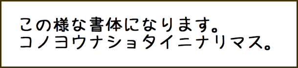
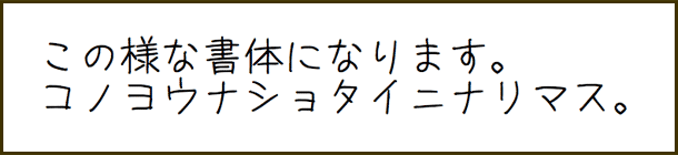
IPA
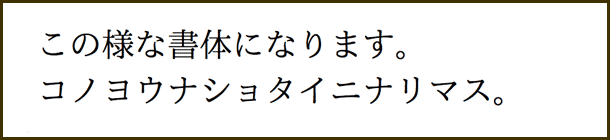
The IPA series of typefaces are a more professional and clean style. If you’re interested in trying a professional typeface that’s different from the factory-installed versions on your computer, try out the IPA series. It also claims itself as a type specifically designed for unity when western and Japanese characters are used together.
Hit “accept” on the linked page (after you’ve read the terms) and you’ll be taken to the download page for the font.
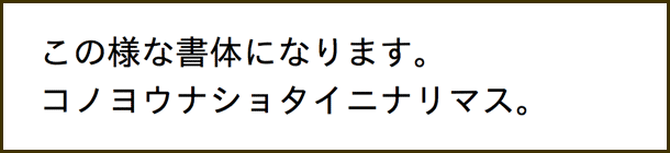
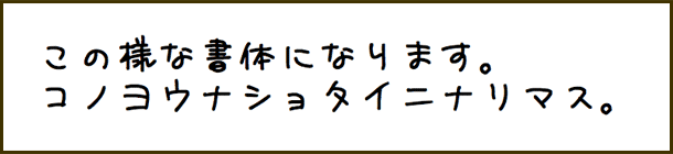
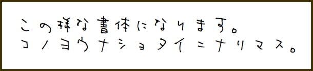
Kouzan
The Kouzan series is a more classic, handwritten style. If you’re looking for something out of a classic samurai film, try the Kouzan series. The website has more than I’ve listed here but some of them just offer variations of the kanji.
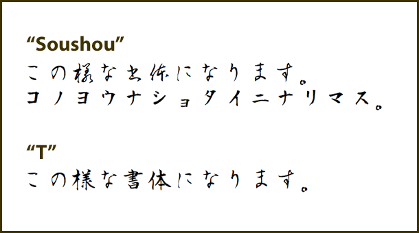
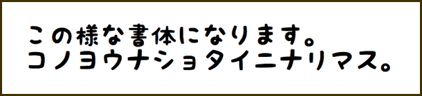
Sanafon
Original
Yu (悠)
Kaku (角)
Maru (丸)
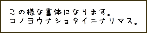
Gyou (業)
Mugi (麦)
This series is pretty extensive. It offers a variety of different typefaces all with a playful side to them. For a more stylistic variety of fonts, give Sanafon a try. Again, there are a few more fonts listed on the website.
Armed Lemon
Armed Lemon is a very stylized, one-off design. It’s great for more casual applications. It also has a sister typeface named Armed Banana which is equally stylish though it doesn’t have Microsoft Office support. *sad face. Go to the main content area of the page I’ve linked. There, below the ad are the download links. Once it takes you to the download page, find the button that says “Go to the download page”.
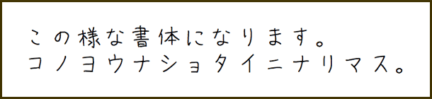
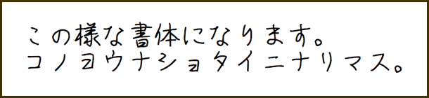
KF Himaji
KF Himaji is another one-off design. It’s playful and fun. Notice the slightly rounded forms. This would be a great font to use if you were looking for a more feminine look as many women round their letters in a similar style when writing. Because of its stroke weight, this would also be a great header text.
In Closing…
I hope you enjoyed this look at some alternative Japanese typefaces and managed to find some new fonts for your library. Remember, before you download fonts and apply them to your work, be sure to understand the scope at which you’re allowed to use them. Usage guidelines and restrictions could change so be sure to understand the scope of what you’re using.
For more information on understanding Japanese typefaces: please read this article outlining the important aspects of Japanese typography and how to understand what the names of each font mean.