Japanese consumers have a strong appetite for US and European brands, but poor localization efforts will turn people away. From language and fonts to images and colours, we explore how to localize your brand and logo for Japan.
A Quick Guide to Brand Localization
Brand localization involves taking aspects of your branding, such as your logo, colors, or typography, and adapting them so they have greater appeal in a different cultural context.
This can also be applied to your broader brand identity, such as the values you choose to promote or the tone of voice used in marketing and advertising.
While it’s true that Japanese consumers have a strong appetite for US and European brands, they also have distinct preferences that must be carefully considered when entering Japan.
The only real way to ensure your logo is playing the role it needs to is to review its impact in the local market with the help of native speakers.
Benefits of Effective Brand Localization
- Conform to local standards
- Increase brand recall among your target audience
- Improve appeal and image in the local market
- Ensure your brand is different and unique from competitors
- Leverage your Western or international origins effectively
Types of Brand Localization
- Translation — Directly translating words, phrases or sentences from one language into another.
- Localization — Translating content into another language with an added layer of cultural consideration to incorporate the way different audiences understand and relate to content.
- Internationalization — The process of adapting a brand slightly so that it retains strong uniformity across multiple markets.
- Cross-cultural design or transcreation — A more comprehensive process of adapting a brand for another culture, which may involve a new approach to design and branding entirely (e.g. changing brand names or slogans).
Learn More About Entering the Japanese Market
How to Adapt Your Brand Logo for Japan
![]()
Each brand should be reviewed and adapted in its own way, but a few key areas to focus on in your process are below.
1. Language
Speaking to people in their native language is a cornerstone of any effective branding market strategy. This applies to everything from your web content and product descriptions to your company taglines and even the text featured on your brand logo.
The goal isn’t just to make something understandable in a new culture, but to make it impactful and meaningful as well. Using Google translate or paying for basic translations of your online content is efficient, but this doesn’t go far enough in ensuring the language you are using is right for your brand and audience.
All of this is to say that even something as simple as your brand name, featured in your logo, should be treated with care during your localization process. If you’re lucky, minimal change will be needed. However, it’s important to check that your company name doesn’t have confusing or even offensive meanings when translated into Japanese.
Interestingly, many of Japan’s biggest and most globally recognized brands feature English text (Latin characters) in their brand logos. This is partly due to companies wanting to increase the perception of global presence and bridge cultural differences when doing business in places like the US.
HB Pro Tip: By keeping English (or any other non-Japanese) text in your logo, you may be able to increase the appeal of your brand and capitalize on your foreign origins in a way that resonates with your target audience. Just be careful that you have run a sense check on your company name.
Logos Used by Japan’s Most Popular Brands
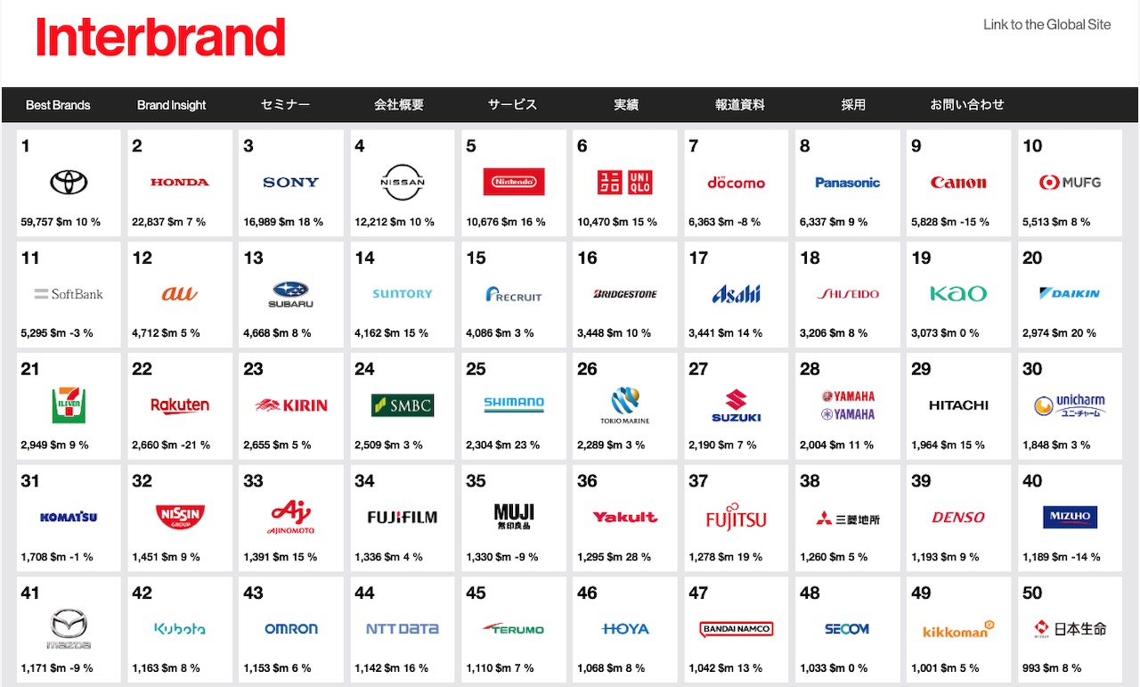
A look at Japan’s top 50 brands according to Interbrand highlights visually how popular logos are that feature text as the main element. Many of these logos feature bespoke and custom fonts as well as the Latin alphabet but do not include image icons alone.
This isn’t to say that these brands don’t also have image based components to their branding which are used in other forms of brand messaging. However, if you prioritize a specific image or shape in your logo, it is worth considering whether this is the right approach for the Japanese market.
2. Font and Typography
![]()
Careless Japanese typography can hurt perceptions of product quality and brand credibility. Using the Japanese alphabet the wrong way can result in your brand seeming unusual or suspicious to local audiences.
Using it the right way can help convince people you’re a credible and trustworthy brand that is likely to produce products of high quality.
Unfortunately, the world of Japanese fonts and typography is complex territory. Written Japanese consists of thousands of characters across four character sets. These are hiragana, katakana, kanji and Romaji (the latin alphabet).
Kanji alone includes over 2200 Chinese characters and should be approached with care during the development of any design work for branding and marketing.
- Hiragana – Kanji is mainly used for the lexical elements: nouns, verb stems, adjective stems, and so forth
- Katakana – Katakana is the form of Japanese syllabic writing used especially for scientific terms, official documents, and words adopted from other languages.
- Kanji — Kanji (漢字) are logographic characters taken from Chinese script. There are several thousand kanji characters in regular use and all have different meanings and most have more than one pronunciation, depending on context.
- Romaji — Romaji is the romanization of the Japanese written language. Often this type of Japanese text is targeted at non-Japanese speakers, such as transport signs.
The Latin alphabet is also used to write the following:
- Latin-alphabet acronyms and initialisms, such as NATO or UFO
- Personal names, company names, and other words intended for international use (e.g. official documentation like passports)
- Foreign names, words, and phrases
- Foreign words deliberately rendered to impart a foreign style or flavor in commercial contexts
HB Pro Tip: Brand designers must also consider how fonts in different languages and alphabets can take up more or less space. If you are using the Japanese language in your brand mark, spacing and logo sizes must be treated carefully.
Discover More Tips on Branding In Japan
Uniqlo
![]()
The Uniqlo logo has gone through a single notable update so far. In comparison with its predecessor, the new emblem looks brighter and establishes a clearer connection with Japan. The earliest design featured the original name of the brand, Unique Clothing Warehouse, in a dark, brownish shade of red.
Next, the new company name in English is already used. It is placed inside a dark, wine-red box. The word was broken down into two parts. The lettering “UNI” formed the first line, while “QLO” was placed below.
Finally, their current design emphasizes the link to Japan as the brand has gained international success. This includes the use of a red and white color scheme, (reminiscent of the Japanese flag), a secondary logo featuring Katakana (one of four Japanese character sets) and the specific font and layout of the text which looks like a traditional Japanese ink seal.
3. Images and Shapes
Japanese companies tend to use logos with text as the main element. And your brand logo may not feature an image at all, but if it does, consider how it will be received by your new audience. A few things to check are:
- Does the image or symbol have any local cultural meaning that will be negative or beneficial for your brand? (E.g. connotations or poor quality)
- Has an image been used by other brands and especially any competitors in your space?
- Is the image understood by Japanese consumers and does it have a place in the local context?
HB Pro Tip: Simply phasing out any pictograms in your logo arrangement may be enough to ensure that it is not having a negative impact on the local audience. Many companies use logos that do not include any pictorial content at all in order to present a simple, straightforward and repeatable brand logo that has relevance in multiple markets.
Yamato Transport Company
![]()
There aren’t many brands in Japan that can get away with using logos that feature an image and no text.
As well as international brands like Apple, Facebook or Twitter that are big enough to enjoy recognition and appeal in pretty much all nations around the world without needing to feature the brand name in their design, the Yamato Transport Company, is one of the few companies in Japan that relies primarily on their image logo.
4. Color Considerations
In many cultures around the world, certain colors can be used to produce certain reactions or associations among local consumers.
Certain color combinations and palates may appear modern and enticing based on their usage by brands, while other sets of colors may appear dated or flat.
In one study carried out into cross-cultural differences in color preferences, Japanese observers were recorded as having a greater relative preference for light colors, rating light colors higher than Americans did and rating dark colors lower than Americans did.
Japanese observers also liked desaturated (muted) colors less than American observers for warm colors (chartreuse, yellow, orange, red, and purple) but not for cool colors (green, cyan, and blue)
Many brands have primary and secondary colors in their brand palettes. Rather than switching to a completely new color for the Japanese market, localization may involve simply focusing on another color within your repertoire for your brand logo and/or other branding elements.
For instance, you may use white with accents of red in your home market, but it may prove advantageous to instead lead with red and use an accent of white in your brand mark.
Brand Logo Localization Mistakes to Avoid
Below are a few major localization mistakes that could potentially unravel your localization process.
| Lack of Differentiation from Competitor Brands | Japan’s vast brand landscape may include companies that have similar names, logos or brand marks to your own. If they operate in a distant product category this may not matter, but the closer they are to your commercial space, the more important it is for you to create differentiation in your brand identity. |
| Overlocalizing | There are many potential consequences of changing your brand too much when entering a new market. These include a lack of consistency with your international identity and losing the benefits of showcasing your Western heritage. Often, minor changes and alterations to your logo will be enough to make it suitable for the Japanese market. |
| Lack of Versatility and Ease-of-Use | Logos that are clean and easy to replicate are best. A logical approach to image and text arrangement (with any pictograms and text separated) will help designers and content creators render your branding for various purposes, such as product design and marketing activities. |
Final Thoughts
Developing a brand logo that can bridge cultural differences can be challenging. Yet, investing enough time and resources into this princess is crucial if you’re looking to expand your operations here.
Our final piece of advice is that when embarking on logo redesigns or localization, keeping things as simple and consistent as possible is always best practice. Text, fonts, images, and colors may need to be changed, but these changes can be minimal.
The important thing is that you check your brand identity and whether its various components have relevance and impact in the local market.