Data visualization can take many simple forms, such as graphs, charts or tables — translating basic information into a visual context that is easier to process and understand.
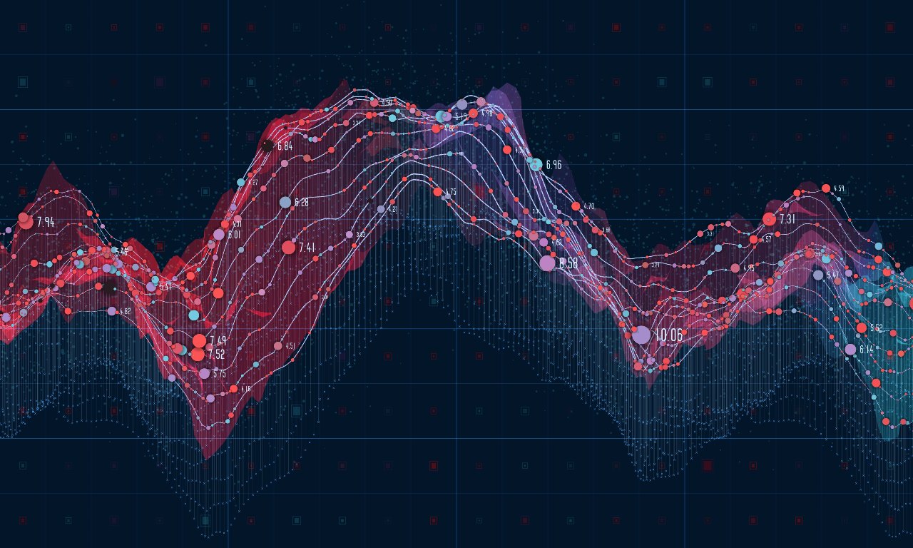
When handling large data sets that would otherwise be incomprehensible to the average reader, visualizations can also appear more complex or abstract, using a combination of shapes, colours and textures to convey meaning.
Today, infographics are one of the most popular forms of data visualization, blending traditional data visualization techniques (used in Japan for centuries) with modern storytelling tactics to support the content marketing and SEO activities carried out by many brands.
In this post, we explore why effective data visualization is so important in the Japanese market and how you can approach data in the right way to cater to local preferences and support your digital marketing strategies.
Table of Contents
The Role Data Visualization Plays in Japan

Many visitors to Japan have remarked on the unique way information is presented. Shop signs, menus, posters, advertisements and a whole variety of digital content such as websites and banners can often seem much more “crowded” and full of information than anything similar in the West.
While the individual methods of visualizing data are not unique to Japan (graphs, tables, maps, charts, symbols etc.) the extent and frequency to which they are used can often seem different and overwhelming to those who are not familiar with the language or used to encountering such a high volume of information in everyday life.
Catering to Japanese Preferences
Japanese individuals have also been characterized as avid information seekers with a strong appetite for technical data. In fact, the sheer volume of information presented in all types of marketing or informational material here far surpasses that seen in Western societies.
It’s not rare to see data and information that is usually reserved for the small print or user manual in other countries regularly featured in audience-facing content in a way that would be seen as unnecessary, ineffective or just too complicated to understand in other countries.
In Japan, having access to information upfront is seen as beneficial in many situations, and indeed preferred. In the commercial world, for example, it allows a consumer to make a more informed decision rather than rely on the assertions and persuasions of a brand’s advertising alone.
Product descriptions, marketing, and all forms of communication that are too sparse in their level of detail may be viewed with scepticism and in some cases frustration.
HB Pro Tip: This is something you need to consider carefully when designing a website for Japan. You will often find more information displayed in a small space and a more substantial body of information and detail is often considered beneficial. Of course, the extent to which you do this will always depend on your brand, products and audience.
If you’re looking to learn more about Japanese consumer preferences, you might want to take a look at our article: Marketing in Japan? 10 Important things You Need to Know About Japanese Consumers
Reducing Cognitive Burden
Assuming that more information is better than less in Japan, the challenge that many advertisers and brands face is how to convey such data in a way that is still digestible for readers. By using certain visual elements and tools, it is ultimately easier to convey information and trends, ranging from the simple to the complex. When done right, the following is also possible:
- Increase the speed of information absorption AND retention, leading to faster and more informed outcomes
- Improve the understanding of what must happen next or the key takeaways from information
- Help the human brain to identify patterns, find trends and pull insights from large data sets that would be too vast or complex to understand without help
- Keep the audience’s interest for longer
- Encourages users to share and discuss information more easily with others
- Remove the need for so much text-based information, while saving space and the money it would cost to secure such space
- Increase the ability of readers to act on findings without making mistakes or needing further explanation
- Create high-value assets that can be used in various marketing, advertising and PR activities
Compressing Big Data
We now live in the age of big data and Japan faces the very same problems all nations do when it comes to taking such large amounts of data and doing something practical with it. Good data visualization helps to build narratives and identify trends so that more people can get value from them.
For digital platforms that profit in some form from gathering data, it’s in their interest to make data as easy to understand and as usable as possible. This has made data analysts as well as services and tools that curate and organize data incredibly valuable.
The Link between Data Visualization and SEO

An infographic is one of the most effective methods of improving engagement with your audiences and link building. With the right combination of data organization, graphic design and storytelling, it’s possible to achieve several things that will support your SEO metrics:
- Strike a connection with cold audiences and get new users to engage with your brand and content online
- Educate users about your products and topics that relate to your services
- Encourage people to share your content with others, due to the concise and appealing nature of infographic content
- Generate more backlinks from related websites that want to feature your content
Japanese users, like those from other parts of the world, are simply more interested in visual content than text-only content these days. There’s still a place for blogging in your SEO approach, but infographics surpass written content on the whole when it comes to engagement potential and shareability.
Want Some Quick SEO Tips for Japan?
What Makes a Good Infographic?
Simply publishing a simple graph or table isn’t good data visualization. For these pieces to function within your digital ecosystem of online content, you must plan them carefully.
You must combine good analysis and data organisation with brand-appropriate design and good old fashioned storytelling to make them really work for you.
Below are a few tips on how to capture your reader’s attention, tell a story and convey complex information in a digestible way, all at the same time.
- Decide on your “hook” and make this clear to the reader with an engaging title
- Convey the context of the data through an appropriate visual theme to set the scene for your graphs, tables and charts. Converting the significance and meaning of the data as fast as possible will keep people focused on the data and make it easier for users of all knowledge levels.
- Like stories, ensure your infographic has a logical sequence where you guide your reader through the narrative using a logical hierarchy. Whether you’re using a top-down approach or creating content modules (distinct areas of space that focus on individual parts of your “story”), readers need to be able to follow the trail with minimal friction
- Highlight core findings and takeaways through visuals and text that stands out. Don’t let people get lost in something that is aesthetically stimulating but lacks an outcome or specific takeaway
HB Pro Tip: Infographics designed for SEO should balance both design quality with editorial excellence. Don’t neglect either component or you’ll fail to convey your narrative in the best possible way. To do this, we recommend working with Japanese copywriters and designers who can work collaboratively to produce your content.
Technical Tips for Optimizing Your Data Visualizations in Japan
- As you would do with highly targeted SEO blog content, create your infographic so that it supports a single keyword or keyword phrase.
- Choose titles and subtitles carefully to make your content scannable and to initially draw in the viewer.
- Ensure your CTAs and key points are highly visible and well placed
- Make sure your content is formatted so your page still loads quickly
- Include a good volume of keyword-rich text on our page to frame your graphic content and signal to Google what your content is about
HB Pro Tip: Always remember that the goal of an SEO infographic is to produce something that appears in a top position when people search for a certain keyword or phrase. As much as it’s easy to get carried away creating something visually amazing, you must still focus on the business/marketing outcome of your data visualization too.
To stop yourself from making important SEO mistakes in Japan, take a look at our blog post: 10 Mistakes to Avoid When Using SEO Marketing in Japan
Choosing the Right Data Visualization Technique
When you think of data visualization, you may imagine a specific style of graph or chart. Some of the most popular visualization techniques include:
- Charts
- Tables
- Graphs
- Maps
- Infographics
Beyond this, there’s honestly so many techniques and approaches that can be used when presenting information visually.
We would encourage you to approach each data visualization process by first looking at your data and exploring which options would best suit your information, rather than working backwards from a chosen technique or format.
The right visualisation must always be paired with the right set of data and forcing information into certain formats (such as simple tables and graphs) could be a wasted opportunity, and, in the worst cases, lead to confusion rather than clarity.
For a full breakdown of visualization techniques, check out this great Data Visualization Catalogue.
Japanese Data Visualization in Action
Both in commercial and everyday settings, the standard for data visualization in Japan is incredibly high.
Early Japanese Data Visualization
There are some incredible examples that showcase Japan’s long-standing love affair with data visualization with experts in this field blending both art and science to create truly impressive outcomes.
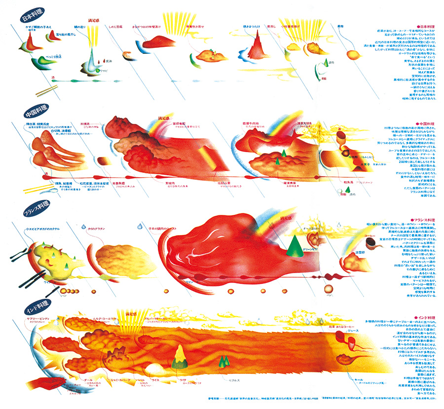
For instance, Kohei Sugiura, a Japanese graphic designer has had an immense influence on designers both in Japan and throughout Asia through his reimagining the way data visualization can work, exploring new possibilities for the field and producing works that are regarded as masterpieces in their own right.
The above example is based on descriptions of tasting experiences by the food critic Toyoo Tamamura, with four diagrams that convey Japanese, French, Chinese and Indian cuisines and their differences in cooking methods, volumes and ingredients.
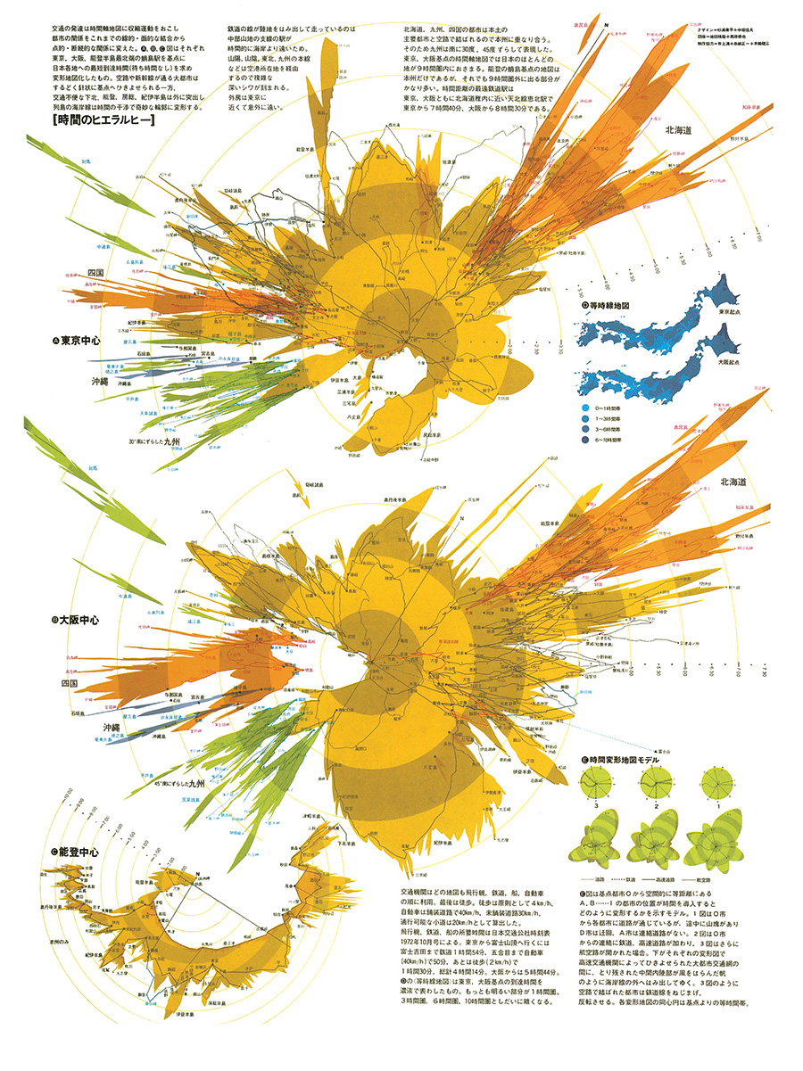
Below, is one of Sugiura’s most iconic works, focusing on temporal distances. These visualizations attempt to juxtapose a basic topographic map with a temporal map focusing on major JApanese cities such as Tokyo and Osaka.
Modern Data Visualization
Not too long ago, Japan unveiled its RESAS program, the world’s largest visualisation system designed to compile ‘big data’ of government agencies and the private sector.
Collating data on demographics, population statistics, people flows and industrial developments, it aims to present this vast body of information in a digestible way that can be adapted and modified based on the intentions of the user.
As a dynamic tool that is both comprehensive as well as truly beautiful in its attention to detail and overall aesthetic, it is a testament to Japan’s capacity to produce data visualizations that are at once accessible by the general public but also function as an academic and governmental tool to inform a wide body of research and initiatives.
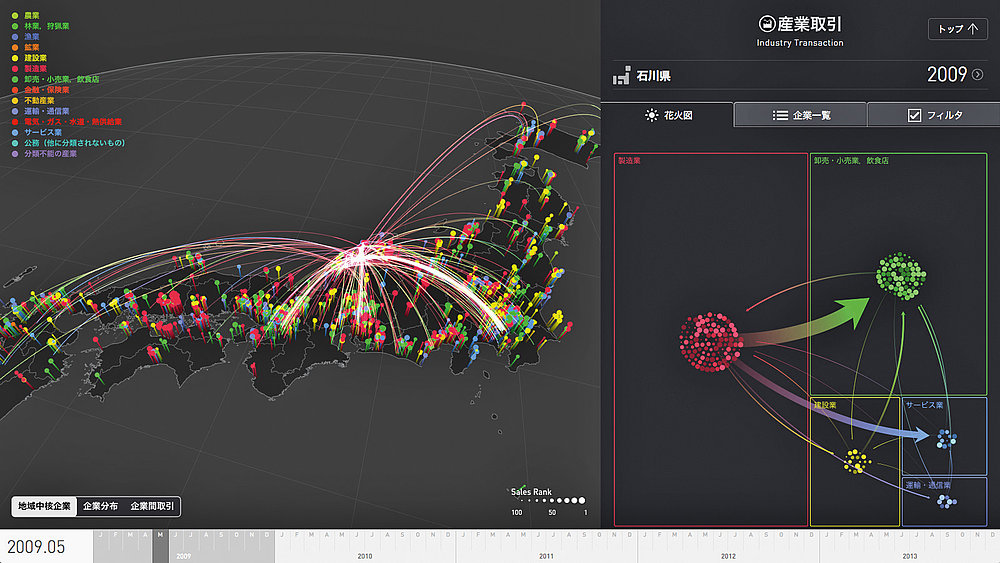
To learn more about this incredible project, you can head over to Takram, the developers of the prototype version of RESAS and watch their explainer video.
Visualizing Covid-19 Data
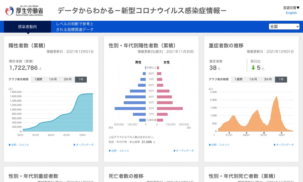
Like many countries, Japan has leveraged data visualizations to inform citizens of essential Covid-19 data, including the number of newly confirmed cases and the demographic and location breakdowns of those affected.
The above image shows the Japanese Ministry of Health and Welfare’s Covid-19 data portal that supplies visitors with a constantly updating dashboard of information related to the pandemic. If you’re looking for inspiration on how data sets can be matched with visualization techniques, it’s a great place to go.
Communicating Product Features through Symbols
Not all data visualizations need to be epic or large-scale. Walking around Japan or browsing Japanese websites, you’ll find many examples of simple and practical visualizations of information, designed to help users to navigate daily life more easily.
When we helped Sleeping Baby with their product pages for Rakuten, for example, we drew on many best Japanese practices for good data visualization to offer browsers a simple and effective way to understand the qualities and features of the brand’s product range — offering clarity over their whole collection without the need for large volumes of text.
In the example below, you’ll find a chart we created to inform readers about how waterproof the brand’s products are.
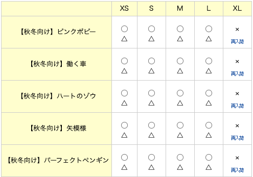
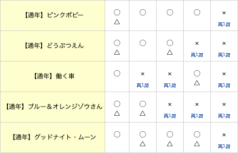
Interpreting this information, while potentially confusing at first glance for a non-Japanese reader, is (hopefully) clear and comprehensive for the Japanese shopper, borrowing a style that users in Japan are familiar with as a method used conveying “how good” a solution is for someone’s specific needs. Essentially, the chart conveys the following.
| ◎ | 100% waterproof |
| ◯ | 75% waterproof |
| △ | 25% waterproof |
| X | not waterproof |
HB Pro Tip: Your data visualization technique should always vary depending on what you are trying to communicate as well as your audience. Consider who your users are and what they expect to see. This should always be the starting point for developing data visualization in Japan.
How to Create Data Visualizations

You might be sold on the need for and benefits of data visualization, but you may not know how to actually create some for yourself.
Fortunately, there are dozens of tools for data visualisation and data analysis out there today that can help you with basic visual repestnatations of information. These range from rudimentary to complex.
Certain tools and methods will require specialist knowledge and experience while others, although simple to navigate, may not allow you to convey the right level of depth and nuance.
Tools for Data Visualization
There are many tools and services that offer data visualization capabilities. Some of the most popular include:
- Canva – Offers users hundreds of infographic templates that can be used to develop simple data visualizations
- Google Charts – A powerful, free data visualization tool that is specifically for creating interactive charts for embedding online.
- Tableau – A huge online library of data visualization options that can be modified with hundreds of data import options including CSV, Google Ads and Analytics data
- Sigma Js – A single-purpose visualization tool for creating network graphs that requires some basic JavaScript knowledge in order to use.
- Grafana – An open-source visualization software that lets users create dynamic dashboards and other such visualizations.
- Chart.js – A simple but flexible JavaScript charting library that provides a good variety of chart types and allows for animation and interaction.
- Datawrapper – A program created specifically for adding charts and maps to news stories.
One of the most common types of data visualization tools are those used for business or performance reporting, often integrating automatic dashboards that track performance across key performance areas. If you use Google Analytics or create reports with Google Data Studio, you’ll be familiar with these.
Essentially, these systems take gathered data and organize and formulate it so it can address key questions.
Commissioning Custom Data Visualizations for Japan
When trying to craft a unique narrative with original data, it’s not always going to be possible to use a DIY data visualization tool. Depending on your level of design experience and analytical competency, you may need to work with specialists who can take what you have and produce a fit-for-purpose data visualization for Japan.
Ultimately, good data visualisation will transcend the specific tools and products that are used to craft them. Whoever is responsible for creating your graphics will need to have a firm grasp of the overarching principles of information visualization as well as sound creative design skills in order to sufficiently communicate key messages.
If you are working with an agency, they may be able to project manage this task for you, but just make sure they have both strong analysis and storytelling skills. You also have the option of working with freelance designers to visualize your data while project managing the process yourself.
HB Pro Tip: When you’re targeting Japanese consumers with your content, you’ll no doubt need native Japanese speakers to handle your content so that it’s 100% localized for the market. Machine translation may get you so far in converting existing graphics into Japanese, but if you truly want to gain SEO traction in Japan, it’s always best to leverage the talent of individuals who are familiar with the Japanese language and consumer preferences.
Get Visualizing!
Data visualization is a powerful way to communicate information in a way that is digestible, easily understandable and comprehensive. As well as creating content that will resonate more powerfully than text alone, you have a good chance of boosting engagement and driving strong SEO performance.
Getting started might seem daunting if your brand hasn’t ventured into this area before, but once you get one project under your belt, you’ll realize how worthwhile it is to invest in high-quality data visualizations such as infographics or interactive charts for your business.
Need help gaining traction for your business in Japan? Let’s chat on how we can help.