このブログは英語表記のみです。
How This Article Came About
A few months ago, I was intrigued to hear some people’s opinions about the state of design in Japan. I posted a topic in a community with the question:
I’ll be honest, I was looking for some heated and heartfelt feedback so I deliberately made the question a bit aggressive.
The perspective of that argument was based around the common notion that western design plays more with negative space, white space and simple layouts, while the Japanese style is sometimes considered more of a “what can we put here?” style. The response was outstanding and from that discussion, I realized that there are a lot of things to consider about the way we design for Japanese audiences.
In this article, I’ll go through a few of those things. So here we go!
Text and Typography

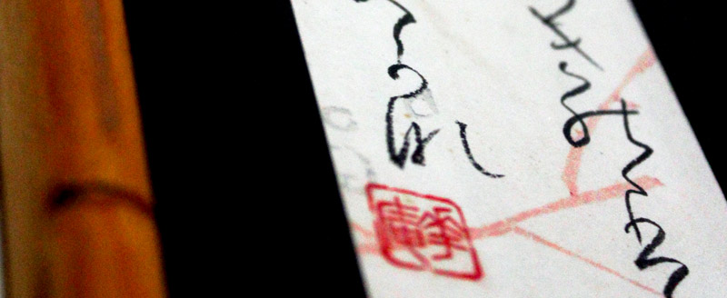
photo credit: crdotx on flickr
When designing for Japanese audiences (albeit any audience), it’s important to keep in mind the nature of the language and the format of its written system.
Perceptive Gray
From a western design stance, designers often strive to get that nice “gray” on the page. By this, I mean that we want bodies of text to appear gray when viewed from a distance or squinted at. This effect is balanced, appealing and a sign of good typography.
Due to the nature of kanji, this effect is nearly impossible. Certain characters contain more strokes than others. Because the amount of space used by every character is uniform, those characters are more dense, thus appearing as a heavier black instead of a smooth gray.
Stand back from your computer, squint your eyes and take a look at the text of this article. It should seem consistently colored across the width of the page. Now look at the Japanese sentence below. Does it seem like some areas with the line are heavier than others?
グラフィックデザインは、主として平面の上に表示される文字や画像、配色などを使用し、情報やメッセージを伝達する手段として制作されたデザインのこと。
Yep. It sure does.
That’s what we’re talking about and unfortunately, you’re limited on what you can do about this. Tis the nature of the written language. Instead of focusing on the reasons why it doesn’t work, if you’re working with a shorter body of text, try working on the spacing before and after the individual kanji characters. You can often give a bit of balance to the composition by stretching out the white space in between these “heavy” characters. Check out this article about Japanese typography for more details on this method.
shorter words = more information
In English, most words are comprised of multiple letters. The average number of letters in any given English word is five. When writing in Japanese kanji, however, most words are only two characters.
What does this mean for reading? It means that you can input more information into the same space when you’re working with the Japanese language.
Have you ever seen a Japanese novel? Or looked around on the train (in Japan)? You’ll notice that the Japanese always have these tiny little books. I can’t count the number of times I’ve had a conversation with a Japanese person about the “hugeness” of English novels.
For a lot of western designers and the idea that less is more, it can be a bummer when the client wants to include a variety of details. In Japan, because of the nature of the typography, this may not be as much of an issue as you’ll most likely have more breathing room to let your design shine.
Verticality
While we’re on the subject of novels, it may be worthwhile to make note of the way Japanese text is presented in them: vertically.
Traditionally, Japanese was written top, down and the books were read from right to left. Basically the exact opposite of western countries. In modern-day Japan, it’s quite common to find a western-style layout, but be aware of the former style and its relevance in Japan.
If you’re building marketing materials or advertisements, it’s more natural to design in a western style (horizontally and left to right), even in Japan. However, if you’d like to pull a bit of the old in with the new, here are some concepts you could try out.
- Why not do your headers in a vertical format?
- Long bodies of text? Write them out vertically from right to left.
- Perhaps your design is going for a more rustic, traditional look. Embellish on that theme by using vertical copy.
- If your project calls for a vertical composition, why not try this style out.
Mobile Access

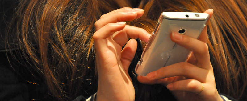
In June of 2011 (already one year prior to this post), 47% of the Japanese population was accessing the internet on their cell phones at least once a month. America at the same time: 22%. What does this mean? Anything you put together that involves the web, must take this mobile-friendly aspect into account. These number of mobile web users is only going up.
I, personally, know many Japanese people with smartphones, but no computers—a nearly unheard of idea in many other countries.
What’s more, Japan is a society of commuters, young and old. That translates to an unusual amount of time with one’s nose buried in their cell phone. Add to this the fact that the daily commute, for most people, is around two hours round trip, that’s a lot of face time for your digital marketing/advertisements.
Japan is a mobile society. Make sure your marketing and advertising efforts are taking that fact into account.
Here are some resources regarding the Japanese mobile market and technology:
Mobithinking.com
Japan Today – Technology
Web-Mo Marketing Expo
Rounding it all out
Be sure to check back in a couple weeks when we continue this discussion. Next time, we’ll talk about necessary content, marketing to the right demographic and some other key points about designing for Japanese audiences.