The unique characteristics of Japanese web design are sometimes a surprising revelation for foreign businesses entering Japan. Dense sections of text, very little white space, multiple focus points and several CTAs on one landing page… these elements, through eyes accustomed to Western design principles, can often make a website seem unnecessarily loud and “cluttered”. But does this make them bad?
In this article, we’ll look at some of the most important (and intriguing) web design trends in Japan, and how the country’s cultural context has created an industry that produces digital spaces that are somewhat at odds with what is considered “good web design” in other parts of the world.
Table of Contents
Japanese Web Design Overview
It’s Not Good vs. Bad
While first suspending the notion of “good” and “bad” entirely, the most important thing you need to do when planning your next web build for Japan is to revisit the very meaning of the user experience (UX). Rather than imagining it as some kind of objective measurement of quality (that transcends culture and location), remember that UX is always intrinsically connected to the preferences and needs of individuals.
When it comes to Japanese UX principles for websites, it just so happens that what people like and expect is different from what you, with a completely different cultural context, might expect from the same things.
So, rather than contemplating too intensely how a culture famous for minimalism and design excellence respected around the world can produce such “crowded” web spaces, spend your time thinking about the role websites and other marketing materials play in Japanese culture and society, and how your own website can conform to the same set of rules and expectations.
HB Pro Tip: The user experience (UX) encompasses all aspects of an individual’s interaction with your brand and products (visuals, imagery, navigation, messaging). If you haven’t already considered how your ideal Japanese target demographics will perceive your brand, make this a starting point for building a website that is completely localized for the Japanese market.
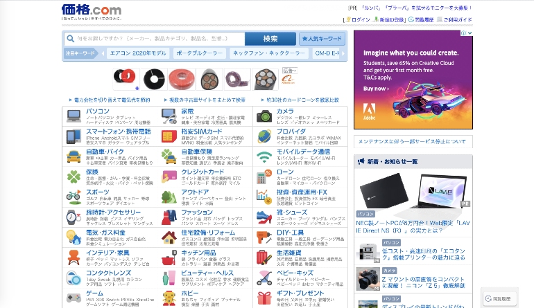
Essential Japanese Web Design Characteristics
- Greater amounts of text and detailed information upfront
- Less white space on page
- Content aims to inform the purchasing decision rather than create an emotional connection
- Multiple scripts are used as well, as both vertical and horizontal text lines
- Smaller and more frequent graphics are used rather than larger high-resolution images
- Data, testimonials, and statistics are given more priority on landing pages to build trust with the user
- Several contrasting colors and design elements are often used within small spaces
Understanding the Landscape
Language and Typography
The way text is displayed is an incredibly important aspect of marketing. In modern Japanese writing, a mixture of three basic scripts is used: Kanji — Chinese ideographic symbols — as well as Hiragana and Katakana — two phonetic alphabets (syllables). Hiragana, katakana and kanji can all be laid out horizontally or vertically and this can contribute to an overall chaotic impression for Westerners. However, this is only natural for the Japanese.
Too Much Information?
Some criticise Japanese web design for featuring too much information squeezed into a small space, yet, Japanese people tend to require more information upfront when making a purchasing decision. This difference is at the heart of why Western and Japanese websites look so different, and what makes it so difficult to unify your web design across both markets.
To win over Japanese shoppers who are naturally more risk averse consumers, it’s necessary for businesses to say more and show more when courting consumers. This requires a more detailed breakdown of product information necessary for shoppers to make an informed decision and overcome uncertainty.
In fact, Japan is one of the most ‘uncertainty avoiding’ nations on this planet, registering as high as 92/100 in the Hofstede Insight’s cultural analysis report. Similarly, the nation has the second lowest level of trust among the mass population, according to the Edelman Trust Barometer, beaten only by Russia for first place.
Therefore, methods of production, materials, functionality, sales policies, user satisfaction statistics, and more are often featured front and centre as a way to give potential customers everything they need to make a final decision and overcome any lingering doubt.
So while non-Japanese websites look to emphasize user benefits more, through content that taps into people’s desires and motivations, Japanese websites will focus more on the technology that actually makes those benefits possible. And this is something that you should be doing too.
The Contradiction of Minimal Design
Minimalism and simple functionality are evidenced in many aspects of Japanese life, from urban planning to traditional art. And while you might expect to see the same principles applied to web design, the problem with minimal design is that it goes against the primary need of Japanese consumers to gather large amounts of detailed information upfront when interacting with websites and other marketing materials.
Also, the Japanese hate waste and look to utilize space — whether physical or digital — as best as possible, ensuring that it provides the maximum value to users. This, as you’ll have guessed, also clashes with a basic minimalist approach to web design, and instead, encourages businesses to use up all the free space they have on page to provide some kind of value to the reader.
As these issues are somewhat less important in Western societies, which focus more on building an initial emotional connection with the user, you’ll more likely see graphic elements and text limited to the bare essentials, putting greater focus on the aesthetic beauty of a page, rather than its ability to inform a user about how a product works.
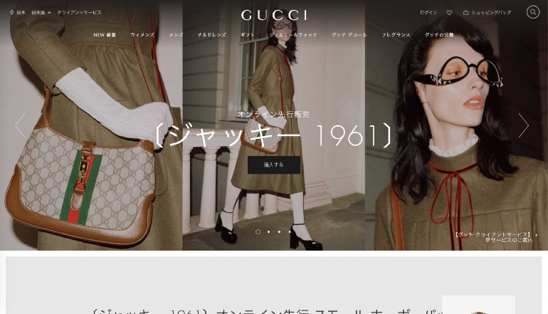
This isn’t to say that minimal web design doesn’t work in Japan. For instance, global fashion labels who already have significant presence here will be less concerned about their brands being perceived as trustworthy or high quality. Instead, they are more free to adopt minimal designs that are similar to their Western counterparts.
HB Pro Tip: If your pages lack information, customers may become suspicious of your brand’s trustworthiness and the quality of your products. This is the last thing you want when you’re new to the market and trying to build a reputation for yourself among more risk averse demographics. If you keep this in mind, you’ll see that having a homepage with barely any text and a few images (regardless of how aesthetically appealing they are) might not be your best foot forward if you want people to actually make a purchase.
Discover More About the Role of Digital Marketing and SEM Advertising in Japan
Popular Japanese Web Design Styles and Trends
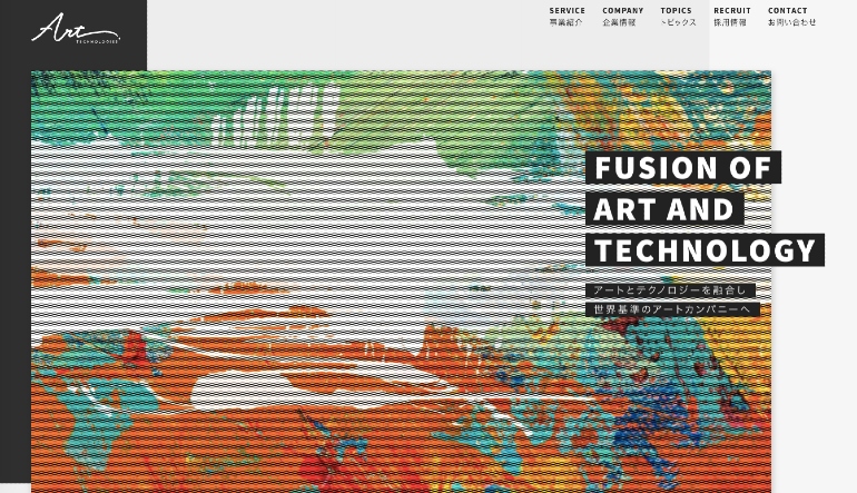
Japanese website designs are fascinating and beautiful. Even with some of the design restrictions and limitations we’ve outlined already, the digital landscape here offers endless sources of inspiration that showcase intelligent uses of space, color, graphics, and technology. Below are some of the most important design trends to consider when building your website for Japan.
Offbeat and Unusual
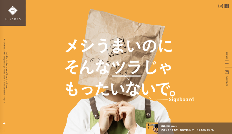
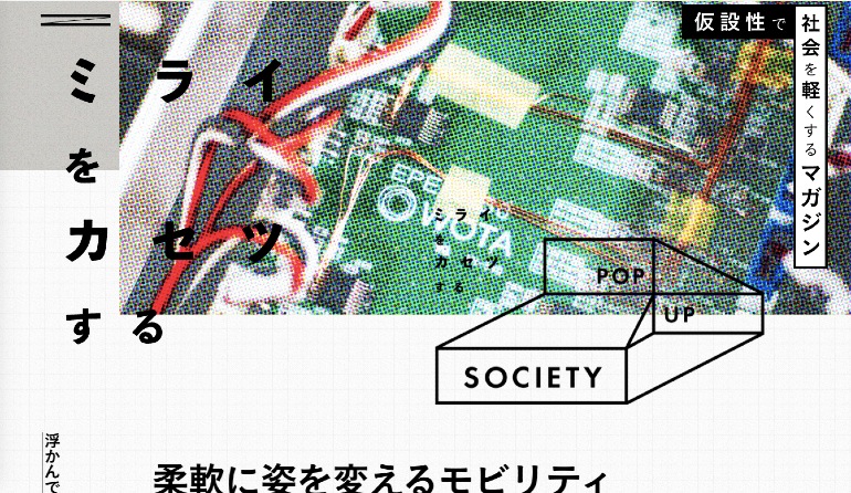
Deliberate rejection of commonplace conventions is a popular design trend for Japanese websites. Rather than showcasing extreme chaos and randomness, the aim to use shape, color, photography and layout to create a unique and distinctive design that stands out.
Vibrant Color Palettes
The Japanese love a wide range of colors and include a diverse palette when designing websites. Neon, natural, muted, pastel or bold are all accepted, and regularly combined within a single page to create interesting creative concoctions. This kind of vibrancy is something the best Japanese web designs showcase.
Cuteness
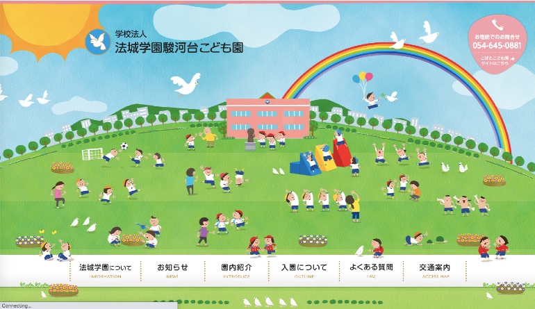
The Japanese culture of cuteness, or “kawaii”, is used all over Japan and across thousands of websites. After spending some time here, you’ll likely develop your own sense of what passes as cute in Japan, but many will find it hard to explain what defines Japanese kawaii to others. Nevertheless, this kind of huggable playfulness is something that thousands of websites use to their advantage today.
We’ve seen color play an important role in all kinds of marketing and branding related situations in Japan. For instance, when we advised one of our clients, DailyFX, to rethink their brand guidelines for the local market and introduce a more casual and colorful design approach, they were able to see an increase in Instagram followers by 30% MoM, as well as an increase in their engagement rate by 16.3% MoM!
Custom Typography
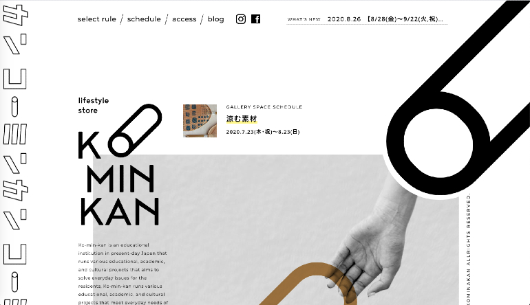
As a branding and marketing tool, custom fonts are a powerful way to convey your brand’s personality. In recent years, there has been a growing trend for many Japanese companies to design (or commission) a custom font.
Mixing Languages
As well as the multiple scripts we’ve already mentioned, the Japanese like to throw in a bit of English every now and then. Graphic designers and web developers are not afraid to mix and match these characters to create interesting visual effects or to add emphasis to particular areas.
Calligraphy & Brush Strokes
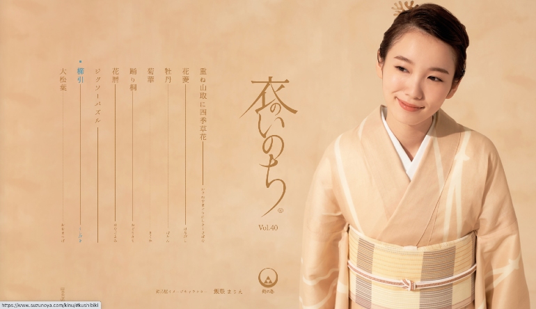
Calligraphy is regularly employed in Japanese web design. As a powerful form of art and method of communicating character, emotion, and personality, many web designers endeavour to employ calligraphy, vertical lines, and expressive brush strokes into the digital spaces they create, to offer a sense of tradition and expression.
Manga
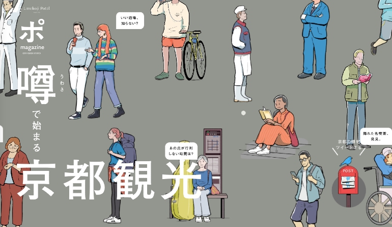
The Japanese people’s wide acceptance of cartoon characters in both animated and static form is something that the marketing world regularly takes advantage of. This is no different for Japanese web designs, which leverage the appeal of comic book style graphics and characters to get their message across to users.
The Virtual Shopping Mall Experience
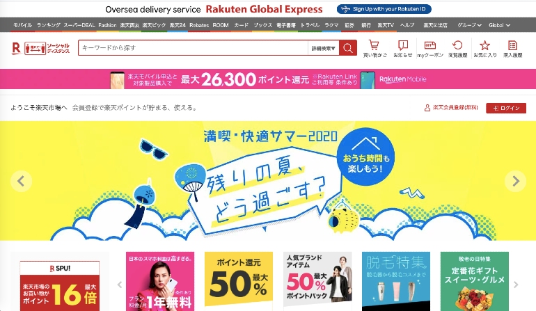
Online ecommerce platforms like Rakuten offer Japanese customers a kind of virtual shopping mall experience that caters to the needs and preferences of Japanese consumers. More information, product details, promotional content, and general opportunities for branding let merchants fine tune their online hubs for better conversions, while giving shoppers an immersive experience similar to walking around an actual shopping mall.
Where is Japanese Web Design Going?
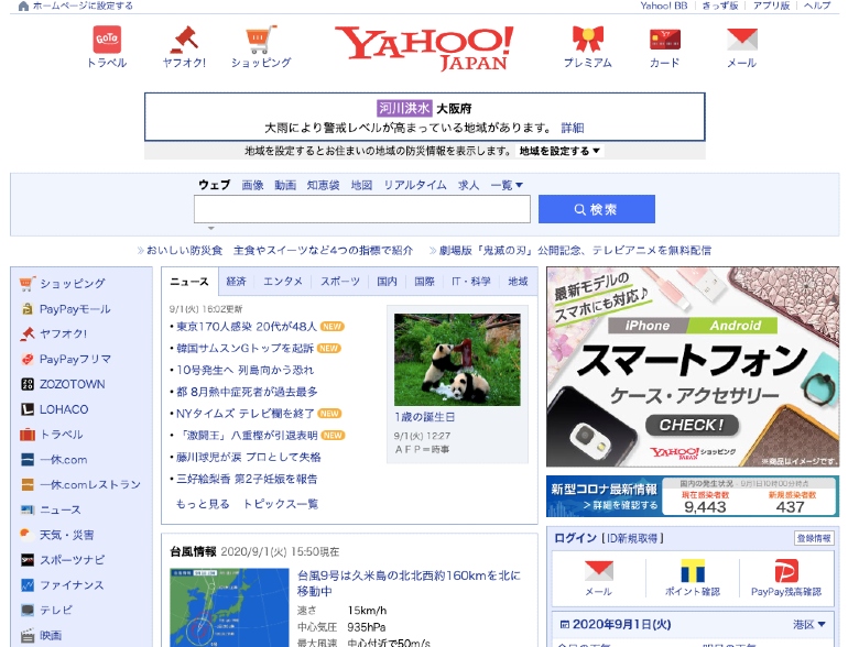
Yahoo! Japan 2013
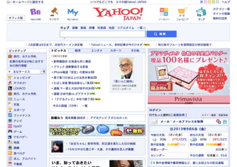
Yahoo! Japan 2020
Recent years have seen a number of new mobile first websites appear — attracting younger audiences with much simpler, smartphone friendly designs. More interactive web experiences have also become popular, with rich and dynamic functionality becoming increasingly important. Meanwhile, many companies continue to be influenced by international design trends popular across Europe and the US, prompting them to somewhat align their approach to web UX.
With this in mind, one could argue that web design in Japan will eventually evolve to match a more global standard. Yet, it’s also true that a number of the nation’s biggest and most popular companies show little sign of changing their ways, such as Yahoo! Japan, whose homepage design has remained very near identical for almost a decade.
Add to this the inherent need to overcome the lack of trust from Japanese consumers, and the fact that homegrown brands catering to the domestic market are often seen are more reliable and trustworthy, and it seems unlikely that a complete adoption of Western style design practices will take place.
Demographic Considerations
It’s been estimated that the number of people aged 65 years or older in Japan will increase from about 36.2 million people in 2020 to almost 36.8 million people by 2025. At the same time, the number of children and those of working age are predicted to shrink.
Consider also that Japanese millennials are generally less financially stable than their parents or grandparents, and it’s no surprise that many brands (and their websites) cater to slightly older users who enjoy the familiarity of older style web designs and layouts.
So, even if younger Japanese people are starting to favour the aesthetics of more Western style web design, it’s fair to say that classic Japanese web design principles will still be widely used for many years to come — catering to the demographics that are the most likely to actually make a purchase.
HB Pro Tip: Older and younger generations are culturally different. Each with their own set of preferences and ideals. Understanding and adjusting your design based on the consumer group you are targeting is a good first step in planning your future Japanese website.
Building an Effective Website for Japan

When building your Japanese website, the process of localization is crucial. As we’ve mentioned before in previous blogs, connecting with your users requires far more than translating your existing brand content to Japanese. Everything, from web design to advertising, should start with a sound understanding of your Japanese target audience.
Website development or localization is always best done with the support of Japanese native speakers and web development professionals. This will help you adapt your brand so that you retain your important values and principles, while portraying yourself in the best light to your new market.
Learn How to Organize Your Website for Multilingual SEO in Japanese
Tips for Structuring Your Japanese Landing Pages
- Use multiple CTAs
- Provide more data and text information upfront
- Include official company information
- Use space efficiently (don’t leave too much white space!)
- Show users real images of your product range
- Show users real people using your products
- Integrate keywords and Japanese SEO considerations from the start
Final Japanese Web Design Considerations
If you’ve reached this point, you’ll understand that Japanese web design is slightly different to what you might be used to. Nevertheless, with your website being a pivotal part of your digital marketing strategy, getting this right, and getting it right early, is an important part of succeeding in Japan.
Without doing away with your original branding style completely, make sure you leave your sense of “good” and “bad” web design at the door, and build something with your end user in mind, based on what you now know about their UX preferences and expectations, not yours.
Need help bringing your business to Japan? Let’s chat on how we can help.
Steal Our Best Ideas
Actionable insights straight from our data
Here are a couple quick discoveries we’ve pulled from the data of our latest projects. Why? To help you make the changes you need to gain traction in the Japanese market! As an agency, we are always digging deeper and searching for those little yet significant tweaks that will push our clients to the next level of success. If you need a partner to help you identify and implement changes like these on a monthly basis, let us know!