One of the great joys of Japanese advertising for foreigners is how removed it can seem from the actual products or brands being advertised.
Whether you’re taking a ride on the metro and getting lost in several bizarre and nonsensical banner ads; scrolling through your phone and being absorbed in a captivating manga-style promotional campaign, or watching an ad on TV that makes you think “I don’t know what’s happening but I like it”, Japanese ads do more than just sell you stuff.
However, what most newcomers don’t see is the many layers of formality in both messaging and design approach. Japan has a rich history of traditional artistic styles and motifs that still influence the techniques used in advertising today, from layouts and colors reminiscent of old-school woodblock printing to ornate calligraphy and unique typographic styles.
In this post, we dig a little deeper into the styles and principles of Japanese advertising and offer some advice for brands looking to get their ads ready for the Japanese market.
Table of Contents
A Brief History of Japanese Advertising
Japanese advertising has long been celebrated for its uniquely graphic visual approach and while it’s hard to trace the roots of everything, there are a few major periods of distinct design and messaging approaches that might help you understand the historical framework of Japanese commercial design.
The Edo Period (1603-1868)
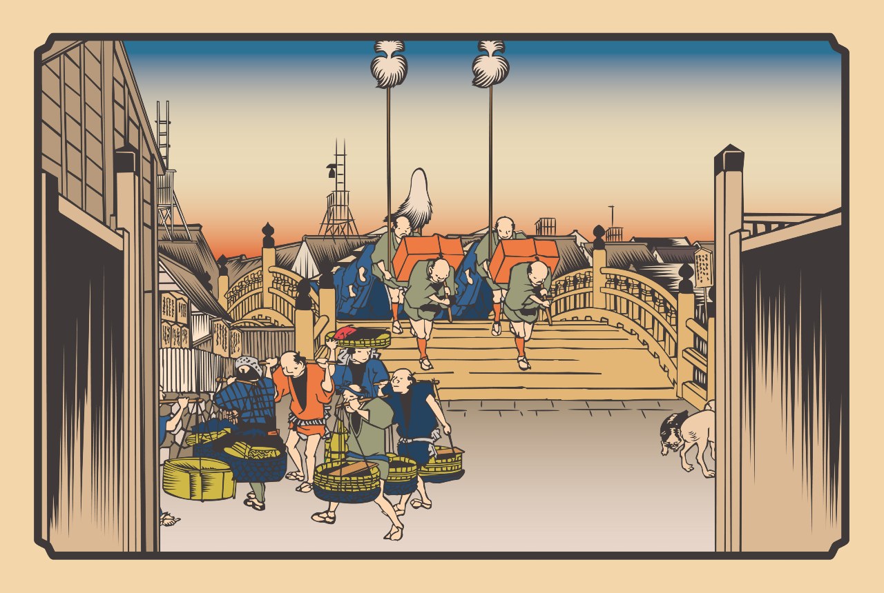
The Japanese Edo period offered the country a thriving commercial sector; burgeoning urban centers; a closely unified nation held together by political stability and highly formalized social structures; and the flourishing prosperity of various trades, arts, and handicrafts industries.
These elements and more provided Japan with the environment needed for traditional advertising methods to first take root as a means for businesses to capture the attention of a population that was increasingly consumer-oriented.
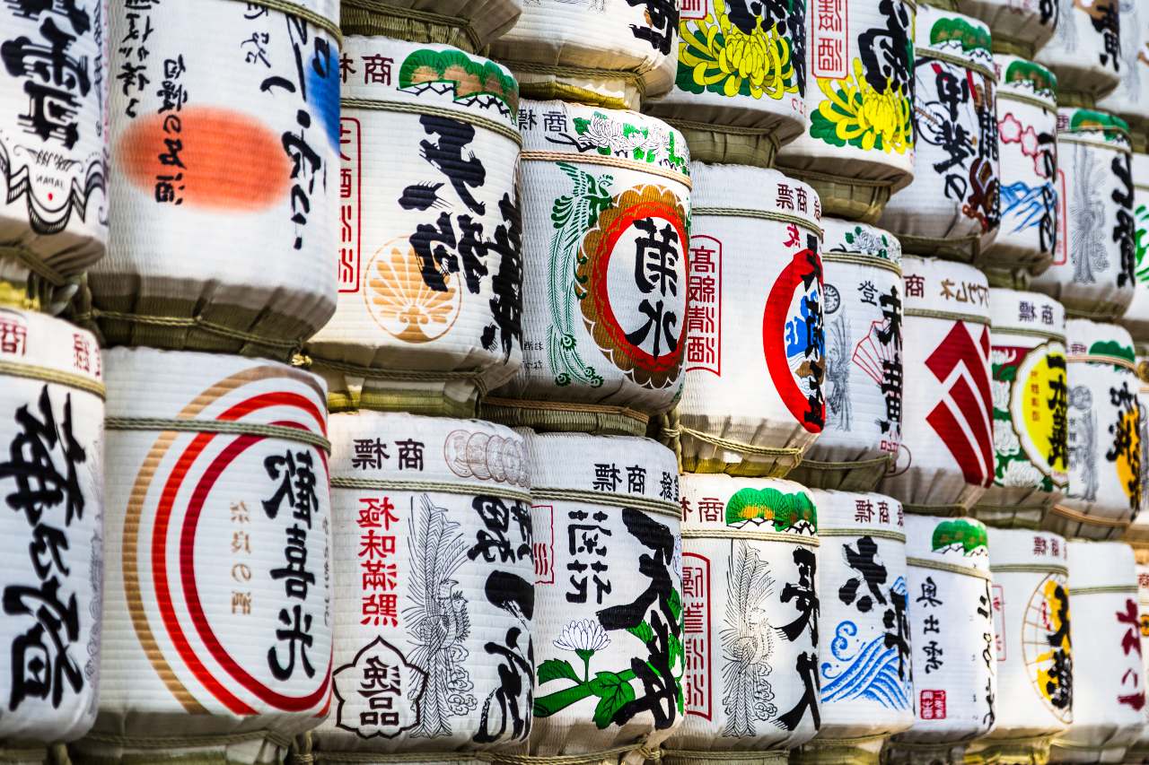
Vibrant and attention-grabbing signboards graced the entrances of stores in much the same way they still do today. This included simple letter signs as well as elaborately illustrated picture signage. Remarkable advances in woodblock printing techniques also boosted publishing and allowed for new ways to communicate with people.
For instance, comic book-style illustrated pulp books first become popular to the masses at this point, often given away at shops as promotional tools. Finally, various holiday events, crowd-drawing performances, and popular shows garnered the need for advertising and promotional content in the form of distinctive flyers and Nishiki-e prints.
The Meiji Period (1868-1912)
During the Meiji period, new methods of transportation improved economic development and commerce in urban centers. This was also a time when Western culture first started to have a significant influence on Japanese society, eventually bringing with it new developments in printing technology.
The appearance of newspapers and magazines, thanks to lithograph technology from Europe and America, and the popularity of this media type was notable and many advertising styles were born from the effort to engage people through this printed medium where large amounts of written and visual information were conveyed to the mass public.
Big brand products like tobacco and alcohol also supported a lively advertising scene with companies competing against each other for audience attention — leading to new methods and approaches to advertising design in Japan.
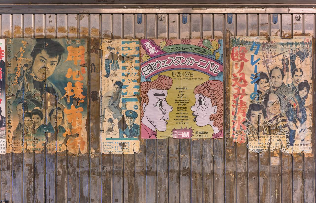
Taisho & Showa Periods (1912-1945)
Many brands still love to reference the Taisho and Showa periods. This was a time of strong economic growth where Japan embraced rapid urbanization and modern Western culture. There’s no doubt that several expressive techniques took root during this time with new technologies emerging and the importance of advertising as a channel for reaching the masses.
New Western photographic and printing technologies also helped promote more sophisticated advertising styles. This was a time of new lifestyles and values and many forms of media focused on creating a refined idea of Japanese culture that was open to internationalism and modernism.
Postwar Japan 1945-1990
After a period where advertising channels were used predominantly for national propaganda purposes during World War II, Japan continued to develop as a mass consumption society. This eventually gave way to the huge dominance of TV, radio, and print (magazines and newspapers) to encourage people to buy various goods and services.
With a growing economy and an appetite for modern products, Japanese society witnessed a remarkable boom in its advertising sector. Traditional approaches to advertising design in Japan were still used by many, but the influence of American graphics and advertising approaches was also considerable.
During this period, graphic design emerged as a respected profession and vital component of the advertising and mass communications sector. Both commercially and artistically, the design industry in Japan was expanded to serve the needs of many — drawing from newer Western styles as well as classic Japanese art theory.
Contemporary Japan 1990+
Artists and commercial designers now have a rich history of graphic approaches to draw from. Yet, as well as formal and traditional approaches to design, there’s a huge amount of innovation and experimentation in visual communication today.
Following technological developments in the late 20th century, the graphic-design discipline has moved beyond its reliance on manual processes, where layouts and illustrations were drawn by hand, to the freedom that computer-aided design offers, with new possibilities in image layering, colors, line drawing, original typography, mixing mediums, and the blurring of several traditional and contemporary styles.
Contemporary Japanese Advertising Design Trends
Below are some of Japan’s more distinct and popular design themes used in advertising and mass communication.
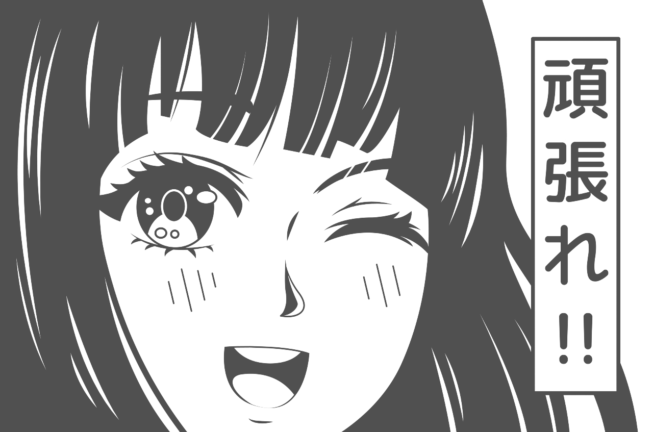
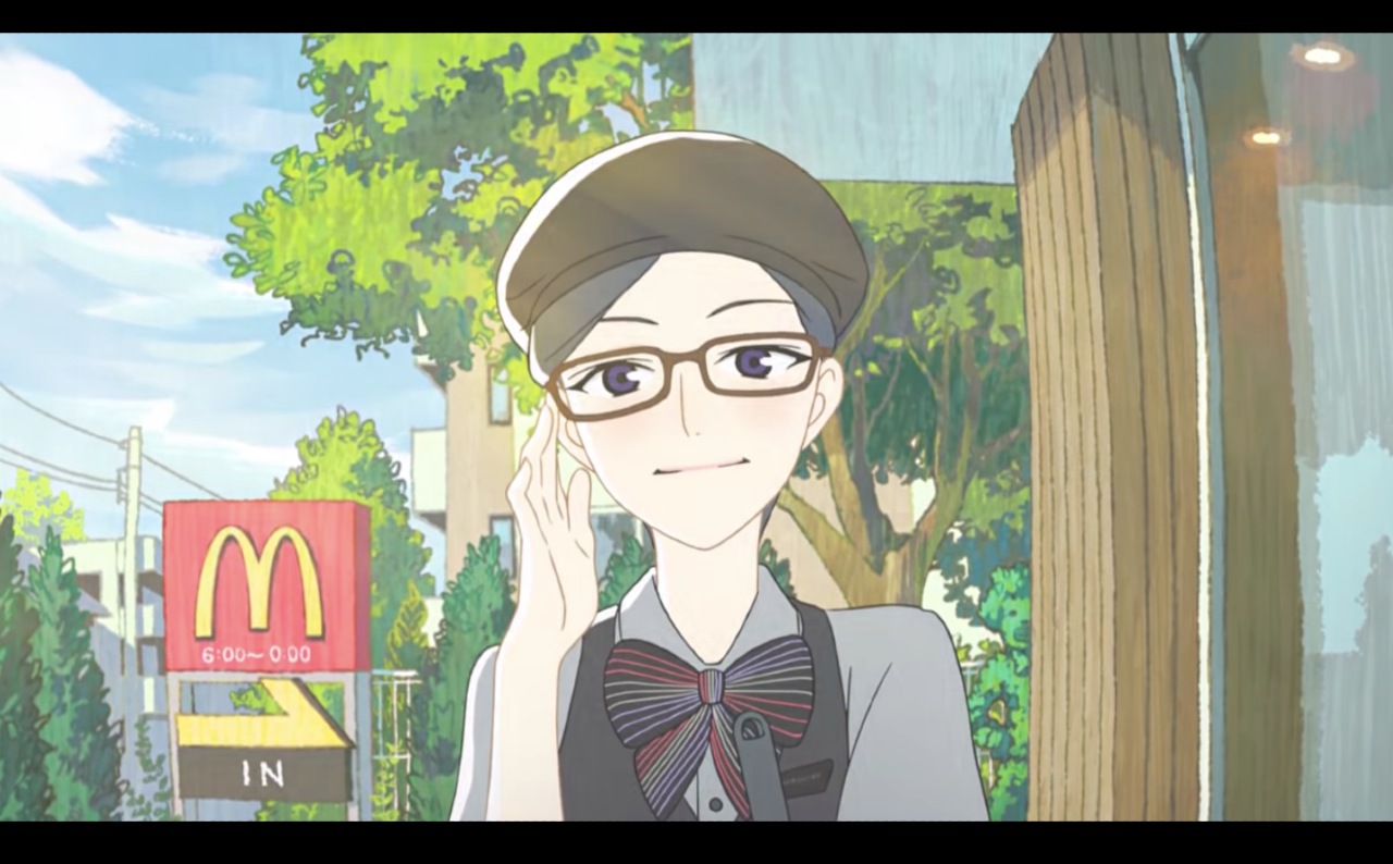
Illustrations & Manga
Manga and anime advertising is used by all types of businesses to penetrate the Japanese market, as evidenced by McDonald’s (above). These comic-style visuals have been used to promote everything from food and beverages to highly abstract or technical corporate services, there’s really no limit.
Generally, for more extensive animated productions, advertisers must work with existing publishers and artists to create original narratives unique to the brand, however, more basic manga-based static visuals can be created with significantly less investment.
One of the major benefits of manga advertising approach is its ability to build immediate emotional connections with your audience and capture their attention without relying too heavily on text. It also helps to add personality to brands that might otherwise lack it.
HB Pro Tip: Manga artwork might look simple enough on the surface, but there’s a lot that goes into matching this type of illustrative approach with your brand. We’d recommend working with designers who are already experienced in Japanese-style manga narratives and how to communicate branded messages through this medium.
Symbolism

Symbolism is everywhere in Japan. One of the best examples of this is seasonal marketing that comes loaded with various motifs, iconography, and images that relate to specific times of the year, like spring (cherry blossom season).
Also known as Sakura, this cherry blossom theme is a common tactic in Japanese advertising design with brands hoping to leverage the unique beauty and mood of the season through advertising content. Tapping into famous Japanese symbols requires the careful use of color schemes, images, and messages.
Notably, we’ve seen color play a huge role in all kinds of marketing and branding related situations in Japan. For instance, when we advised one of our clients, DailyFX, to rethink their brand guidelines for the local market and introduce a more casual and colorful design approach, they were able to see an increase in Instagram followers by 30% MoM, as well as an increase in their engagement rate by16.3% MoM!
The Bizarre & Nonsensical
One of the best ways to capture someone’s attention with Japanese advertising design is to create something high-impact and bizarre. It doesn’t necessarily need to make sense. The main thing is giving your audience something visually exciting and stimulating to feast their eyes on.
If you’re able to make an impression on passing commuters, you’ve done a good job. And if your content is bizarre enough, there’s a high chance people will eventually try to find out more about your campaign and the brand. It’s a way to give your audience something interesting and enjoyable without directly selling them something upfront, also known as the famous Japanese “soft sell”.
Cuteness
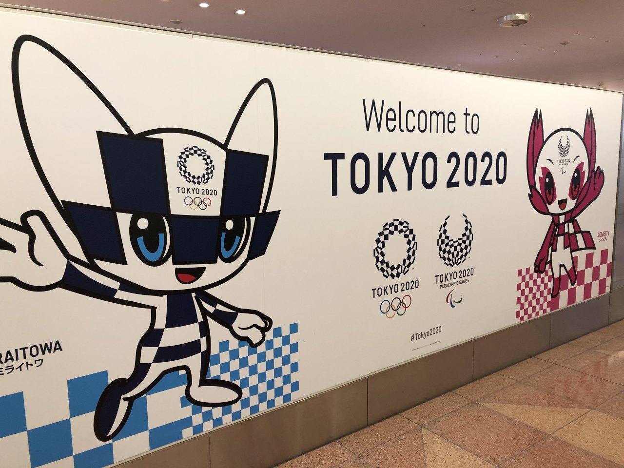
The cute and the charming is an incredibly popular approach in Japanese advertising design. Whether it’s Haribo giving giant sumos the voices of babies or promoting Tokyo Olympics using small charming mascots, many domestic and global businesses have made important achievements by leveraging cute and charming approaches to advertising.
Key Lessons for Foreign Brands and Designers
It’s easy to get lost when you’re trying to create graphic content for the Japanese market for the first time. It might seem like you have a lot to contend with and very high visual standards to meet, however, it’s possible to do well if you keep things simple and choose a specific route that works for your brand, rather than trying to do too many things at once.
Broadly choosing your aesthetic direction and major themes first, and then finding a way that you can adapt this approach to match your brand communication goals, is usually a good first step.
As well as some of the common threads we’ve already mentioned there are many popular aesthetic themes you can draw from, and there’s no rule saying you can’t leverage styles and approaches you already use for other markets, as long as you make sure to localize for Japanese tastes.
Other Popular Japanese Design Themes
- Simplicity and minimalism
- Elegance and refinement
- Sophistication
- Nature and fluidity
- Mystery and depth
- Systematic, organized and modular
- Youthful vibrancy
HB Pro Tip: If you’re a brand looking to create some amazing graphic content for Japan, we recommend looking for designers who are already based here and have existing design experience in the Japanese market. Designing for a completely different consumer mindset can be hard to do, especially when we’re talking about Japan.
Discover More Japanese Advertising Trends
Important Considerations for Web Design in Japan

The world of Japanese websites is incredibly exciting for anyone interested in design. As well as offering a surprising approach to visual information presentation, where much greater volumes of textual information are normal, there’s a huge amount of experimentation and innovation happening right now.
The approach you take must be a suitable approach for your target market. While many older Japanese users prefer traditional formats and layouts that focus on delivering large volumes of information, younger audiences who land on your brand will find popular Western styles more appealing, featuring fewer images and text in more minimalist design schemes.
A few key Japanese website design trends to be aware of are:
- Greater amounts of text and detailed information upfront
- Less white space on each page
- More content the focuses on informing the purchasing decision rather than creating an emotional connection
- Multiple scripts and original typographic fonts can be used in both vertical and horizontal orientation
- Smaller and more frequent graphics are used rather than fewer high-resolution images
- Data, testimonials, and statistics are given more priority on landing pages to build trust with the user
- Several contrasting colors and design elements are often used within small spaces
To learn more about this topic, take a look at our blog: Japanese Web Design – Intriguing Trends and How to Cater to Users in Japan.
Design Advice for Brands Entering Japan

When working on the visual components of your advertising campaign for Japan, we understand if you’re finding it hard to get started. However, it’s worth taking the chance to embrace the sheer volume of opportunities you have when considering your aesthetic approach to commercials and promotions in Japan.
There’s perhaps no place on earth where you can draw from such a diverse range of graphic approaches and styles with roots in traditional artistry and craft, as well as more modern innovations. But if you still need some advice in this area, we’re always happy to talk with new brands about suggested approaches to Japanese advertising design.
Need help gaining traction for your business in Japan? Let’s chat on how we can help.
Steal Our Best Ideas
Actionable insights straight from our data
Here are a couple quick discoveries we’ve pulled from the data of our latest projects. Why? To help you make the changes you need to gain traction in the Japanese market! As an agency, we are always digging deeper and searching for those little yet significant tweaks that will push our clients to the next level of success. If you need a partner to help you identify and implement changes like these on a monthly basis, let us know!