Website and app design rely heavily on knowing (and meeting) the needs of a specific audience. And while many would associate Japanese design with simplicity or minimalism, when it come to UX, that’s not always the case.
While browsing the nation’s top apps and websites, it’s obvious that several unique and intriguing design trends exist. All of which, Western companies building digital products for Japan should keep in mind. In this post, we explore our top 4 Japanese web and app design localization tips!
Information Hierarchy
In app design, it’s crucial that priority is given to certain information to guide users through their online journeys and give them what they’re looking for in a convenient and practical way.
A simple way of viewing things is that, in Western cultures, audiences tend to prefer less clutter on-screen overall, with only the most key details displayed — typically blocked out into logical and separate groups with the aid of white space, color and visuals (where suitable).
On the other hand, many traditional Japanese websites, and to an extent more modern sites and apps, will feature much more information on single pages. Sections may even blur into one another due to very little spacing and a high volume of written text.
The truth is that there’s a much higher tolerance for information and technical detail in Japan, as well as a preference among some groups to learn through text. Many have also commented on the role that text information plays in building trust between users and brands/businesses and that providing less content overall can seem “mysterious”, “unfinished” or “vague”.
This isn’t to say that you need to fill all your pages with text, but if the situation calls for more content then you should be willing to adapt your design accordingly. When catering to Japanese users, especially older demographics who are less familiar with global design trends, be mindful of the impact that your layouts and information organization is having on peoples’ process.
Discover Our Top 5 Timeless Japanese Advertising Style Tips for the Uninitiated
Navigation

Navigation preferences can change from country to country. In addition to the title given to certain groups or categories being different, or for groups to be categorized in a different way altogether, the overall structure of your navigation bars could need adapting.
For instance, if we are to assume that Japanese users prefer to have more information upfront, it may be practical to offer more menu items and links in initial stages of their app journeys, rather than offering a more sequential ordering of items where new page links appear as users click through from top-level categories to more niche groupings.
Obviously, you won’t want to do this at the sacrifice of smooth and efficient user flow (due to too much information being presented in your menus), but there is perhaps a balance to be struck based on what you know about your audience. Generally, apps targeting older users should be more cautious of how Western best practices could be viewed negatively.
Typography in Japanese App Design
The Japanese writing system consists of thousands of characters across four distinct sets: hiragana, katakana, kanji and the Latin alphabet. Each set has its own limitations and benefits in terms of conveying information. And to make things more complicated, they can be used separately or in combination within the same sentence or page!
With that in mind, it’s difficult to simply translate English app content into Japanese using one of these sets, especially when the shape and nature of these sets is so different to the Roman alphabet system that you may be used to. Also, Japanese writing doesn’t use spaces between characters and this can create a cluttered effect in some cases.
When engaged in Japanese app design and localization, you’ll need to have a decent understanding of the way these character sets work and how they impact things like meaning, visual weight, texture and context before design starts. Poor typography choices can impact the user’s experience on your app and alter someone’s ability to find the information they need.
HB Pro Tip: Some Japanese websites and apps might seem too text-heavy and even unembellished. However, as we’ve mentioned, Japanese users have a much higher tolerance and expectation for written content and, in certain situations, don’t require overemphasis of graphics or additional UI elements. Sometimes the considered and strategic placement of text on-screen is enough to meet the needs of your users.
Advertising Design in Japan – Styles, Principles and Practical Advice for Foreign Brands
Colour Psychology
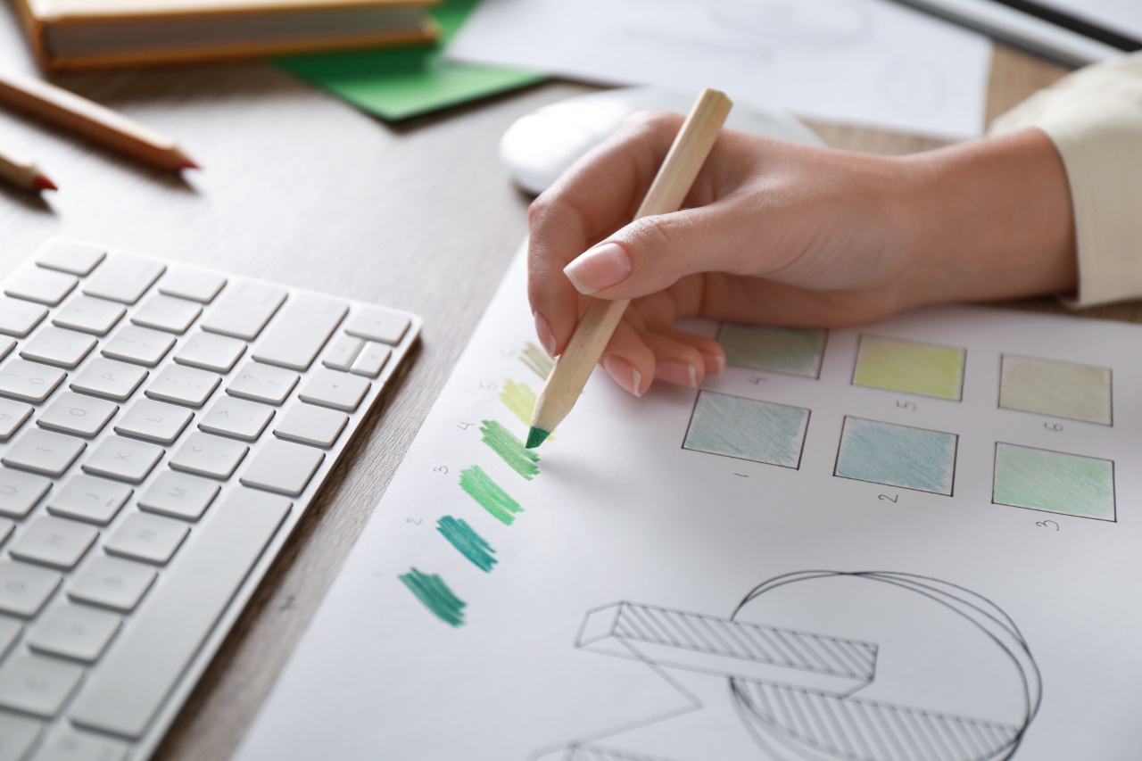
Various studies suggest that the color associations and preferences between consumer groups in different countries can differ substantially. For instance, one study found that Taiwanese consumers believe red is a more fitting colour for energy drinks while Japanese consumers associate drinks of this kind with the colour blue.
Equally, many Japanese apps and websites feature a huge array of different (sometimes clashing) colours on a single page — contributing to a busy and overwhelming experience for users not familiar with this style.
As part of your Japanese app design process, you’ll need to carefully consider how local color connotations and how your design palette choices impact the experience users have with your app. A color palate that appears cluttered or loud for one audience, may seem vibrant and rewarding for another!